Testing a mobile app is all fun and games until the screen recording goes wrong. Don't worry! We got all the specifics. Check it out!
Mobile usage has been soaring all around the world. ComScore found in their Global Digital Future Focus report (2018) that in the United States, smartphones accounted for 60% of all digital usage minutes. The same report found that, of those minutes spent on smartphones, 80% of them are dedicated to using apps.
People are relying on their smartphones more and more, with apps evolving to be the main thing we use when surfing the internet. But while there are most likely hundreds of thousands – if not millions – of apps out there, most of them fail to become popular.
The pitfall lies somewhere between a poorly defined product and usability levels that most users today won’t tolerate, leading to apps that fail to leave their mark.
While this chapter doesn’t cover the planning of the app concepts, it does aim to deal with mobile usability tests, and how we can ensure our app lives up to users’ standards.
Mobile usability testing is, in broad strokes, how we make sure users can achieve their goals with the app. It involves having participants who represent your future users perform tasks with the prototype in a controlled environment.
Like many aspects of UX design, there isn’t a one-size-fits-all approach to mobile usability testing. The way you go about conducting the test will depend largely on your product and resources. However, the main idea of reaching users’ standards will prove true to any product out there.
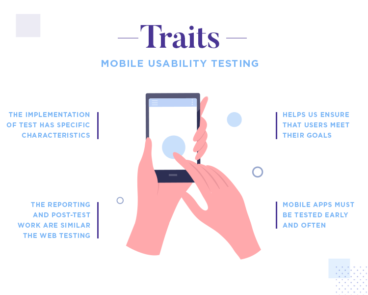
So what changes between web and mobile usability tests? You may be surprised by the answer: not that much! As experienced UX designers will know, usability testing involves a lot of work before you test anything at all. Planning is crucial and can be a lot of work, following the exact same lines in mobile and desktop formats. The reporting and post-test work also remain the same.
The main difference in the tests refer to the actual implementation of the tasks and testing. Mobile devices can have interesting consequences in usability tests – but we’ll get to that in a minute.
Planning a mobile usability test covers many different factors, all of which will come together to create a full study of the product. Before you even consider recruiting, you have some key questions to answer first. You want to get a few things done early when it comes to planning, so you have time to make adjustments as the test draws closer.
First, try to define the basics of your mobile usability test.
What will you be testing? The level of fidelity has some impact on how you go about testing the usability of your mobile app. A low-fidelity wireframe in the bare bones, for example, makes for testing of the navigation design. A high-fidelity prototype can be tested in more ways and is likely to deliver much more insight. Additionally, the higher the fidelity, the more realistic behavior you’ll obtain from participants.
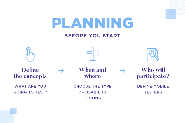
When and where will you be carrying out the usability study? This aspect of your test is when you’ll be confronted with the challenges and benefits of moderated vs. unmoderated user testing, as well as remote vs. on-site testing.
Who will participate in the test? Once you have a better idea of the kind of test you want to run, it will be easier to define who will participate, and how you can reach them. For this part, you may want to draw from the market definition of the app, and/or create user personas to find the right participants.
Awesome resource: Check out our post with 15 user persona templates to see what they should look like, and get a head start.
Defining the participants on both demography and behavioral traits is key. You need the participants to really represent your target users for the test to add any value to the product! Once you know who you want to take part in the mobile usability test, you can start to think about recruitment.
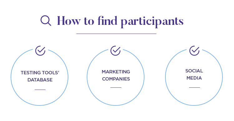
For remote and unmoderated tests, the very testing tool you use may help you find potential participants. Tools like UserZoom or UserLytics offer their users a large database of people, and many different filters to narrow down on the right ones. For on-site tests, some designers turn to their marketing firms or just use social media to find people.
Even as you plan the usability testing of your mobile app, you want to make sure all the relevant stakeholders have access to the plans and functional specification documentation you’ll be creating. This is something that brings several benefits to the final product and to the team.
Firstly, the more people you bring into the mix, the more knowledge you’ll be able to count on. This means that your developers should be in the loop, for example, as they may have valuable insights as to what technical features need to be tested. Another example may be your marketing team, who would be likely to want to test all the product’s branding.
For more detail: Check out the Nielsen Norman Group’s article Involving Stakeholders in User Testing.
It’s better to have everyone look at the plans for the test, so you can all make your observations – and the final plan and be adjusted as needed to accommodate everyone’s concerns. This will, in general, result in a more comprehensive mobile usability test and less design mistakes in the long haul.

Another massive benefit of bringing stakeholders into the usability mix refers to business representatives and other management personnel. It’s a good idea to keep them in the loop, as that will give them a good idea of how the usability study is conducted – making them more likely to trust your decisions and findings.
We recommend sending a copy of the test plan to stakeholders, and calling a meeting to go over everyone’s input. This is the time to settle on a specific path, narrowing down on the exact tasks and to write the script for the post-study questions for participants.
Website usability test setup is pretty straightforward. Most testing tools out there today will make the signup and recording of sessions a walk in the park – you just need a clear idea of what the test will look like. But what about mobile usability tests? The set up process for mobile products is a bit more advanced, as it involves some issues with the devices.
For your testing sessions, you need to decide on a few crucial matters. Your app can be oriented towards a specific operating system such as iOS – which sets a clear path as to which devices you need in the testing. For apps with versions for more than on operative system, you may need to do some research as to what versions and devices you’ll want to focus the mobile usability test on.
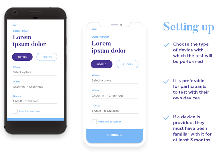
The issue of the device touches on a few factors. Ideally, you want participants to bring their own mobile devices (making their device a trait in the recruiting process). This means avoiding giving people a device they aren’t familiar with, which can impact their behavior during the test. Alternatively, you could provide the device, making sure that the participants have used that operating system for at least 3 months.
But then there is another issue with mobile devices for usability testing: how do we record the screen? There are a few options, each with their own limitations and advantages.
Mobile recorders. These are browser-based apps that record the behaviour of the participant with the mobile app. With these apps you can often record both the actual screen of the device as well as activate the front camera so you can see facial expressions. However, these apps can be a drain on the battery and may result in large files in the device depending on how long the test takes.
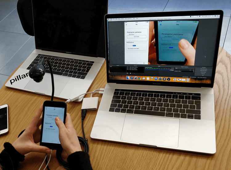
Mirroring. You can install a mirroring app on the device so the screen can be transmitted to a computer. This can be easy and cheap to set up, but it does means you’ll want a camera in the room, so you can also record body language of participants. If you need an example, Reflector is a mirroring software that enjoys popularity.
BTW: If your mobile usability test involves installing an app in participant’s devices, do factor in the time it will take for participants to get all set up for the test.
Cradle camera. A small camera that is mounted on the device itself. This option also calls for a secondary camera to record the user’s body language and expressions. The cameras themselves are cheap and easy to set up, though they can be bulky and get in the way of users. Depending on how it’s set up, there may be awkward angles where the participant’s hand blocks the view of the screen.
Table camera. Just two cameras set on the table, one focused on the device screen while the other focuses on the participant. This can be a nice backup plan, so you’d have these cameras to fall back on if your first option fails for any reason.
Mobile devices bring about some concerns when it comes to our ability to run the test smoothly. For example, you have to be careful with the glare of devices if you plan on using a camera to record their screens. The last thing you want is to find that parts of the recording were unusable, or waste time during the actual mobile usability test to change the glare in each participant’s phone.
Yet another interesting issue with mobile usability testing is that people tend to move their hands around as they use their phones, to get a more comfortable grip. If you’re recording their hands holding the phones, opt to mark the acceptable area that the screen can be in on the table, so they know the borders of the camera’s view.
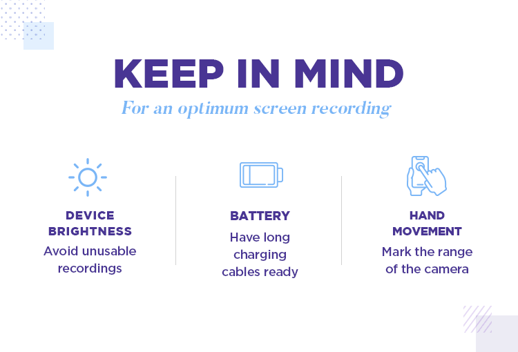
Lastly, there’s the subtle issue of battery. Some mobile recording tools can be a real drain on the battery of the device, leaving you in danger of an interrupted mobile usability test. To avoid this problem, make sure you have long charging cables at hand for participants.
Similarly, remember to have all participants shut off their notifications – they interrupt the flow and concentration of participants, and can mess up your recording.
We recommend you always run a pilot test. Mobile usability tests can be tricky, with many things that could go wrong and compromise the entire study. Even a small miscalculation could result in a bad recording, or a poorly planned task could fail to bring the insight you wanted on a feature.
Enter the pilot test. It’s usually better to do this a few days prior to the actual mobile usability test, so you give yourself time to make any necessary changes. The idea is to use this trial test to find any trouble with the planning of the mobile usability test. This includes everything from checking post-test questions, to making sure the room you chose for the test has good wifi connection.
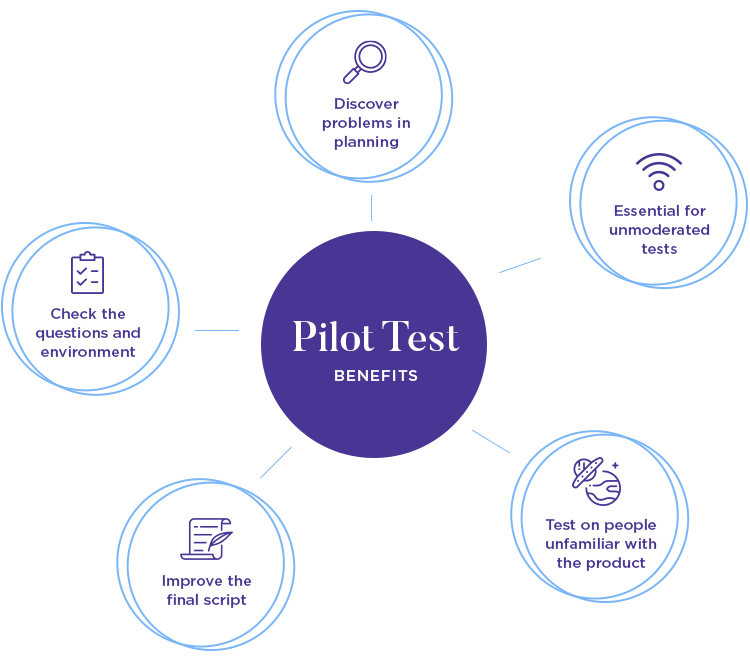
Running a pilot test is particularly important if you’re carrying out a remote unmoderated mobile usability test. As participants will need to do the whole thing without any assistance, you need to make sure the tasks and questions are crystal clear, and that the entire test runs smoothly.
Feel free to use a colleague as that first participant – or perhaps a friend. The important thing is that this person not be familiar with the product at all, so they are in the same footing as participants. From this trial test, you can improve on the final script and plan until you have the mobile usability test you need.
As you may expect, the work that takes place after the actual mobile usability test is very similar to web-based products. It’s all about analyzing the data and identifying trends, issues and possible improvements.
It’s important that you take some time to go over all the data from the usability study, so that you can present your findings to the stakeholders. The way you go about presenting these findings is very important, as it can determine if your recommendations are approved or not by higher management.
The idea is that you present all the trends and statistics in a visual way, with graphs and pie charts. Chances are, you’ll be sharing the report with people who don’t come from a design background. For this reason, be sure to use simple and casual language, and assume readers aren’t familiar with industry terms.
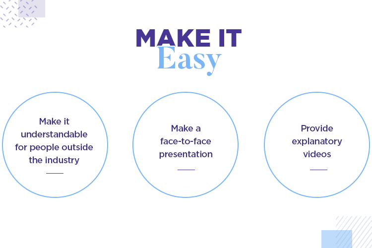
It can be difficult to picture issues simply by reading them, just as it can be tough to communicate the importance of fixing a certain issue through writing. And so, consider going further than simply sending a report and actually make a presentation where you explain your findings in person.
Having an actual time to present and explain what happened, what you found and how the issues could be mitigated opens the door to better communication. It also allows you to use video to add context. For example, if you have a certain feature that confused users, adding a clip of the exact moment several users struggled with the feature may have a bigger impact than simply writing about it.
Most UX designers will know that one can find all sorts of issues in usability studies. They may be issues that are minor in nature, and could be overlooked without harming the overall usability. Or they may be catastrophic issues that absolutely need to be fixed for users to be able to use the product.
Your report should do more than simply state problems. Part of the work that is involved in writing the mobile usability test report is that it needs ways to deal with the issues we found in the test. Upper management will truly appreciate the presence of not just issues, but also of solutions in the report.
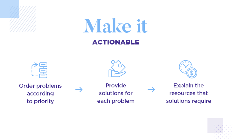
That is not to say you need to present the perfect answer to each problem. You may find yourself with many different issues that were identified in the mobile usability test, meaning you need to categorize them by order of priority.
The important thing is that you classify the issues and problems according to their importance or urgency. With each problem, include a possible solution you can implement. Going the distance, include what kind of resources, how much time or effort would need to be invested with each solution you present. This will jumpstart the debate on what to do next.
Lookback is a versatile mobile app usability testing tool. We like that the tool makes it easy for you to work with more people in the tests, with features like inviting other stakeholders to watch the test remotely. The app is compatible with pretty much all systems and devices, making the testing easier for products that span across platforms.
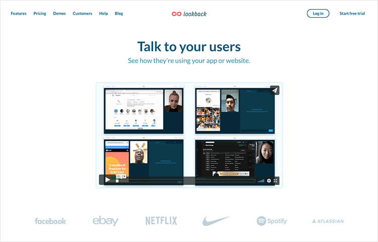
Lookback also takes notes of when participants tap and generally interact with the product. You’ll find all the information on participants nicely catalogued in case you have more questions for them in the future. We also love that it includes a feature to create highlights of key moments to share with your team.
- Price point: starts at $49 per collaborator per month for the Starter plan. To export recordings, Pro plan is needed at $99 per collaborator, per month
UserZoom is one of the leading usability testing tools out there, and it’s easy to see why they are so popular. The tool enjoys a whopping 120 million possible participants in their database, while still giving users the option of bringing in their own people for the tests.

Don’t miss out: We got together with folks from UserZoom and discussed the role of data in products updates. Check out UX research for updates that matter.
The tool records the screens of users and can access the front camera of devices for a view of participants’ faces. Aside from the classic user recording, a benefit is that the tool helps you create the right kind of study according to your goals – which includes everything from card sorting to advanced usability research.
- Price point: available upon request
Another classic name in the usability testing game. UserLytics records participants’ faces and screens while the test is taking place, but it goes further. The tool also keeps a clear track of some key metrics that will help any usability test, such as time on task or success/failure rate.

BTW: Both UserLytics and UserZoom are integrated with Justinmind for the ultimate prototyping and user testing combo. Check out the other Justinmind integrations for more information.
You can also create shareable notes that are listed out under the user recording, for easy communication with other team members. It’s a good tool for remote unmoderated mobile usability tests, as their Branching Logic helps you establish a hiccup-proof test gameplan.
- Price point: starts at $49 per participant, for Quick and Easy plan
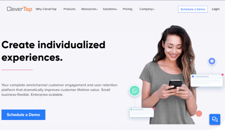
CleverTap is a mobile usability testing tool that offers some great behavioral analytics capabilities. As mentioned before, catering to the right group of users is absolutely crucial for insight in any mobile usability test, and this testing tool helps teams to do just that.
The CleverTap tool makes it easy to see who did what and when – the tool records every click, every swipe. You can find an overview of how users behave on your app, opening the door to meaningful optimization of the user experience.
- Price point: $249 per month
Mr. Tappy is, to sum up, a hardware kit for mobile usability tests. The idea came from the need to film usability tests on iPads. Now, they sell a kit that works for all mobile devices out there. The way Mr. Tappy works is by using magnets to attach a HD camera to the mobile device, so you can see the screen from the user’s point of view.
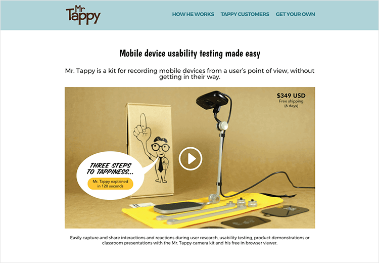
The tool comes with the free option to see the stream of video from the camera on a computer. The tool works well for what it is, but you do need a second camera to catch those crucial facial expressions.
- Price point: $349 for entire kit (shipping cost included in price)
