A/B testing many things can be a nightmare. Fear not - multivariate testing is here to save the day! Discover how you too can make big changes all at once.
Multivariate testing is a similar concept to A/B testing, but it’s got its own magic tricks and benefits. When trying to test several things at once, having an actual method to go about it beats random testing – every time.
That’s why Mvt (multivariate) testing has earned its place in the hearts of many marketers and UXers out there – it gives us a method to test many things at once. Like all methods, it requires you to get familiar with how things are done and what factors are at play. And so, let’s get into what multivariate testing is and what it looks like in practice.
Multivariate testing can often seem like a complex matter. Often perceived as A/B testing’s cousin, Mvt testing takes things just a step further. But before we get into what carrying out Mvt testing looks like, let’s get a firm grasp on some key concepts that influence the testing.
- Visitor potential: Every single person who lands on your product, as they are potential customers. The idea is to turn as many of these visitors into customers.
- Conversion funnel: The actual difference between the total number of visitors to the number of users who convert, doing a desired task. This applies to clothing stores trying to sell or a blog trying to get subscribers to a newsletter. The users who don’t convert are what we call “leaks” in the funnel.
- Conversion rate optimization: Tactics we can employ to improve our conversion rate, fixing and patching up any leaks in the funnel. Multivariate testing is one of these tactics.
- A/B testing: Showing two different versions of the same page to a representative number of users and studying which one has the best conversion rate. It’s recommended to only have one difference between the versions, making it a straightforward conversion rate optimization tactic.
It’s important to understand here that these tactics to improve your conversion are commonly used, for example, in digital marketing campaigns. Many pieces of software out there such as Mailchimp, offer A/B testing on email marketing campaigns that seek to accomplish a goal, such as selling a special edition of a product.
Pro tip: Full-blown testing is better with high-fidelity prototypes in the case of a brand new product. If you want to create prototypes quickly and easily, why not try our prototyping tool?
With that said, A/B testing is not just for marketing purposes. In UX design, this kind of testing can have a powerful effect on the usability and effectiveness of your product. In the end, it’s not just about getting users to do what you want, but also about improving your product as a whole.
The two can seem surprisingly similar. The two follow a similar process in the sense that one needs to do their homework and form hypotheses, with the process for both continuing in close connection. There are, however, some key differences that make Mvt testing more appropriate depending on what you wish to test or what your goals are.
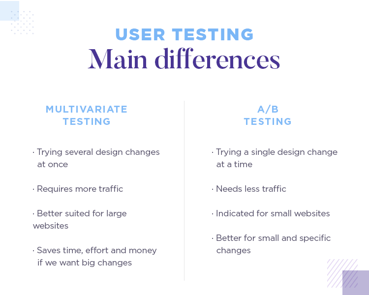
First off, the most obvious one: Mvt testing, as the name indicates, implies testing a combination of several variations of the design and its components. The goal isn’t so much to define which element works better, but rather which combination delivers better results as a whole.
The fact that we are testing several different elements in multivariate testing does have a few consequences on both the practical and theoretical side of the study.
For example, Mvt testing requires a much higher quantity of traffic for the study to deliver meaningful results. In A/B testing, we split the traffic going into the study in half. In Mvt testing, we need to split it in 3, 4 or more times, in order to test every possible combination of variations. These things can add up pretty fast!
However, this key difference between A/B testing and multivariate testing can also be a good thing. If you have a page that needs a makeover and you’re open to change many elements in the page, a Mvt test can save you the trouble of running several A/B tests in a row – saving you time, effort and money.
Running a multivariate test is quite similar to an A/B test, but there are a bit of complex factors that come into play. Let’s go over the process of running a multivariate study.
Choosing a tool is a clear requirement for you to run a multivariate test. There is a wide array of tools out there, as you’ll find in our post on the best A/B testing tools.
The main factors you need to consider include which of these testing tools offer multivariate testing (some, like VWO, offer it while others stick to classic A/B testing).
Other factors include the price in relation to your budget, or how the data from these tests is presented to you. We recommend you go for more visual data representations such as graphs and pie charts. These make for easier interpretation and help you speed up any reports you need to write regarding the study as a whole.
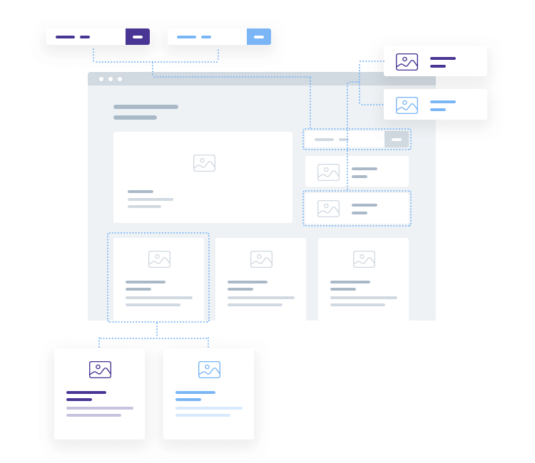
Aside from defining the actual tool for the test, you also want to define what will be included in the test. This means specifying a page or pages you’ll be testing, and establishing a certain number of variables to include. This can seem like an easy step, but it might surprise you.
The number of variables will directly result in the number of combinations you have to test. The math behind the traffic requirements – and how they relate to the number of variables you’re testing – is simple, but it has major implications.
The tricky bit is that even adding one more variation into the mix will make the number of combinations jump. This is a really important aspect of Mvt testing, since the higher the number of combinations, the more traffic we’ll need to allocate to the study. Splitting traffic between the 2 versions and some 12 versions is not the same kind of task at all.
If you know already which elements you’ll be testing, you’ll need to design variations. Logically, these variations will largely depend on your product, your design team and your users. The main idea is that you be selective with these variations.
That is to say, if you know you’ll be testing an image on a product page – resist the urge to include 8 variations of the same image. The total number of combinations has to be kept to a realistic margin, especially if you don’t want to have to wait a long time to get results.
For example, if you’re testing something that is time-sensitive, you’ll definitely need to keep the combinations to a minimum.
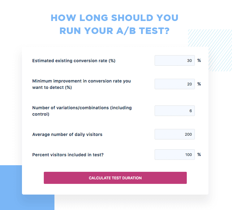
It’s not always easy to estimate how long your test will take. There are many factors to be considered, like who many combinations or how much daily traffic your product gets. This is true of A/B testing and even truer for multivariate testing – the combinations tend to stretch the duration.
We recommend that you make use of a calculator, like the VWO A/B test duration calculator to make things easier.
Here are some things to bear in mind when carrying out your multivariate testing.
Many people aren’t aware of this, but there are actually two types of Mvt testing. The first is what most of us think of when it comes to Mvt testing: full factorial testing. In broad strokes, this simply means that traffic is divided equally among all combinations in the test. This is the generally recommended type of testing, because it makes no assumptions regarding what influence any of the variations will have.
Don’t miss out: If you’re passionate about data in UX, check out our article on qualitative data and prototyping at NASA. It’s all about letting the numbers speak and learning how to listen.
The other type is called partial or fractional factorial testing. You may guess from the name, but this implies that only a fraction of the combinations actually receive any traffic. From our 12 combinations, only 6 of them would receive traffic. For the remaining 6, we’d need to make assumptions in order to get some mathematics to deliver some data for them.
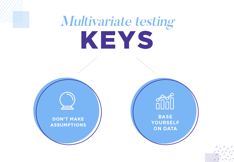
Clearly, making assumptions is not something we recommend here. The whole point of multivariate testing and A/B testing is to let the data speak for itself: data-driven design the way it’s meant to be done. The second we start making assumptions, we introduce our own opinions where only hard facts should be considered.
Not all UI elements were created equal – especially when it comes to their impact on conversion. It’s always good to keep in mind that some elements are more likely to affect conversion than others. This is made clear as day when you have a good testing tool, such as VWO.
VWO offers a powerful report of test results, in which you can find a section by section analysis of how much each one impacted the conversion rate. In the example below, you can appreciate the major difference between a CTA button and the headline of the same page.
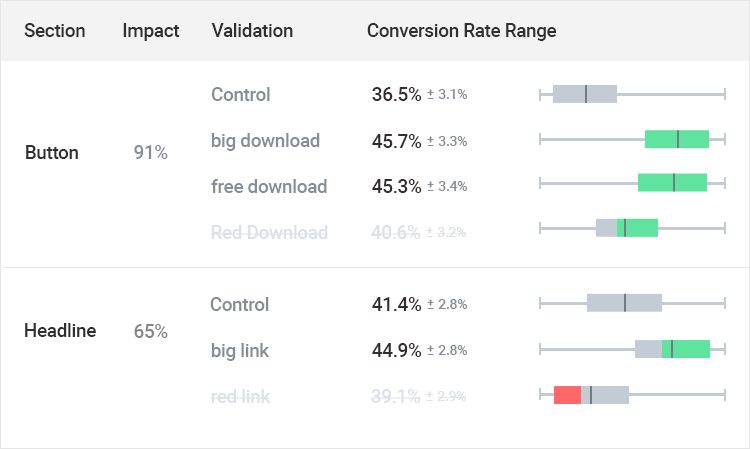
VWO is one tool that shows exactly the impact each component or section had on the study. Check out their Multivariate Testing capabilities for more information.
It’s important to cover all your bases. While it can be relatively easy to say “let’s test everything” and leave it at that, we strongly recommend you take a look at each of the final combinations.
That is because even though all variations might look fine on their own, things may change when you see them in context with each other. It can be as simple as a visual imbalance or something that doesn’t quite add up. Either way, you want to give yourself the chance to prune your combinations so you don’t waste time and effort into something that will ultimately fail.
Remember that your combinations all represent a longer time and more traffic needed for the entire study.
In the end, multivariate testing follows similar footsteps to A/B testing. It is true that the process is a bit more complex, but it’s worth it when we consider what stands to be gained from these studies.
All conversion optimization techniques and studies are worth checking out. The power these methods and tactics can have over the conversion and usability of your product is all but limitless – it’s only fair that you have all the knowledge you can on them.
