Michael McWatters, UX Architect at conference non-profit TED, talks usability, prototyping and spreading great ideas in Justinmind’s latest Q&A.
It’s one of the most recognisable digital brands of the last 30 years, a non-profit devoted to the dissemination of good ideas and an engine of inspiration for well over a billion online viewers.
So how does New York-based TED create online experiences that match the innovation and inspiration of its conference talks? Justinmind spoke to the non-profit’s UX Architect Michael McWatters to find out what it’s like to build user experiences for a global community speaking over 100 languages, and how prototyping helps him stay on track.
Tell us what an average day looks like for TED’s UX Architect
On any given day, I might be sketching on a whiteboard with a colleague, writing a project brief, developing user flows, mocking up a user interface, or testing prototypes with users. Because we’re a UX team of two, we do it all. That’s why there really is no average day—and I love it.
You studied Fine Arts – how did this background contribute to a career in UX?
I learned the fundamentals of color, composition, pattern, and repetition, skills that transcend fine art, and are applicable in any design role. But I also studied architecture, industrial and graphic design, experimented with tech, and was a few credits short of an English minor.
These other disciplines helped me become a critical, curious thinker and a better communicator, skills I think are essential in UX.
There was no such thing as a degree in UX when I went to school. The closest one could get was to study HCI, and that was considered much more technical than creative, so it didn’t feel like a fit. Ultimately, I wanted to make things for an audience of users, not just an audience of observers, so I began to focus on design jobs after my masters.
I think a broad, multidisciplinary education grounded in a creative practice like fine arts helped prepare me for the broad, multidisciplinary field we now call UX.
TED is a non-profit. How does that impact on UX design at the organization? Does non-profit UX bring specific challenges or opportunities?
Being a non-profit means we run lean. When you’re lean, you have to be extra creative and resourceful, you have to look for ways to maximize your resources while still creating the best products possible.
There are challenges we want to tackle that we can’t, but that’s true in any organization. At the same time, being part of a non-profit also means we feel inspired to create things with meaning and purpose.
How does UX work in the TED team? Do you swear by any methodologies or tools?
I tend to think of our methods less as a strict set of steps and more as a framework to get your product where it really needs to be: in front of users. So while we do have preferred methods and tools, we aren’t dogmatic about them. If we can skip or truncate a phase, we do.
The same thing is true for tools: if a paper sketch is sufficient, we’ll skip mockups or prototypes, for example. We look for tools that allow us to work efficiently and quickly, and to share and collaborate with others as much as possible, so we can get feedback early and often.
The one practice I do swear by, however, is the project brief. I try to start every new project, big or small, with one. Critical elements include a bit of background, objectives, user info, potential features and functions, and next steps. Of course, more detail can be added as well, but these are the basics.
Creating a brief not only helps me wrap my head around the product we’re working on, sharing it with the team and getting feedback ensures we’re all starting with the same understanding.
Being part of a non-profit means we feel inspired to create things with meaning and purpose.
TED has a hugely varied user base, from people who just want to see talks to TEDx organizers and attendees – how does that impact on your work?
I think the biggest impact of such a widely varied user base is that it makes our work more interesting! Getting to know the wants and needs of unique groups of people, and then designing for them, is a great challenge.
In practical terms, it means we have to constantly think about what a TED experience feels like overall, and how that translates to distinct audiences. How do we keep the essence of TED, but tailor it to specific user groups?
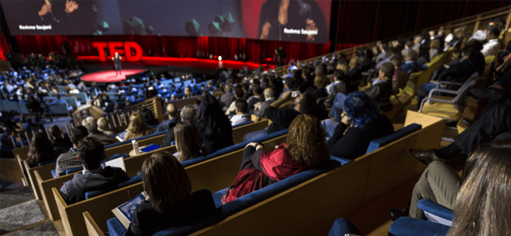
Image courtesy Creative Commons
You took the TED site through an overhaul not long back. Can you summarize the process and tell us about the role of prototyping in revamping an existing site?
We called it a redesign—and on the frontend it was—but most of the heavy lifting involved backend systems. Architecturally, the new site has a lot in common with its predecessor, but from a design perspective it was a big refresh.
We had a collaborative relationship with HUGE, our design partner on the project. At times, in fact, it felt like we were just one big team, not agency / client. We had rolling design phases and we’d do as much testing as possible with users throughout the process.
We’d frequently test mockups one day, make revisions overnight, and test the revisions the next day. We worked as low-fidelity as possible, with the goal being to get in front of users quickly, not create polished designs. It was hectic, but very productive.
Can you tell us about a time when prototyping contributed to you producing something cool, or solving a tough situation?
Prototyping has proven invaluable on numerous occasions, but I’ll share one example from my past—not TED—that I think demonstrates the power of strategic prototyping. We were redesigning the dashboard for a financial services client.
The client didn’t want to include specific performance data in the dashboard, hoping instead to encourage users to contact them directly for a “high-touch” experience. We disagreed with this approach, but the client overruled us.
In order to expose the problem, we asked permission to test high-fidelity prototypes with actual users—the client’s most valued customers. When we shared the dashboard prototype, users had a pronounced negative reaction to the lack of performance data.
One went so far as to say that the lack of performance data made him feel like his concerns were being ignored, and that his money was being wasted on a useless redesign.
By exposing the problem with a prototype, we were able to convince our client to include performance data in the redesigned dashboard. More importantly, we saved them from wasting money on a redesign users didn’t want, and from frustrating their most important customers.
What are some of the challenges facing UXers right now and how can they solve them?
I think it’s a great time to be in UX. Organizations are more aware than ever of the benefits of a user-centric approach to product development. Teams within orgs are thinking “user first.” There are more and better tools and resources to support what we do. And, there’s work to be had!
There are challenges, of course. The biggest is perhaps the oldest: convincing orgs to adopt and integrate a user-centric approach to product development. Even today, UX is sometimes seen as time-consuming, costly, a luxury. It’s easier to skip it altogether, ignoring the potential consequences of doing so.
We need to continue to evangelize our profession within our organization and outside as well. We need to demonstrate that a user-centric approach doesn’t just benefit users—it benefits the orgs we work for. We need to expose our processes and showcase our victories.
Internally, there are discussions and debate about what, specifically, UX is. Do we do UX or UI, or both? Should we focus on specific tools and technologies, or act as generalists? Is it Product Design or UX?
Some believe that as our profession matures, these questions will resolve themselves, but I don’t think that’s the case, nor should it be. I think of UX as a spectrum of related disciplines. I think this lack of codification and narrow definition allows us to be flexible and to adapt to changing technologies and trends.
At a personal level, it’s less important to define who you are as what you do. How can you contribute to making things better for users?
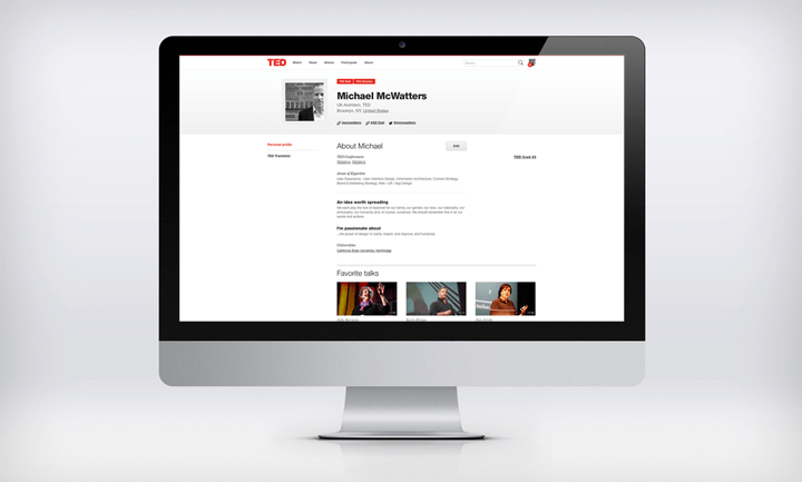
Image courtesy Michael McWatters
What will UX (and TED!) look like 10 or 20 years from now?
I started down this path about 20 years ago. If you’d asked me then what I’d be doing today, I’m certain it would bear little resemblance to my current job. Things change too quickly and there are too many variables for anyone to make an accurate prediction about our field. That’s what makes it exciting!
If I had to guess, however, I’d say that we’ll be thinking less about systems that attempt to define and direct user interactions. Instead, we’ll increasingly focus our efforts on designing systems that adapt to users, systems that are more predictive and proactive, less rigid. It will be less about trying to shape experiences and more about adapting to them.
With regard to TED, I believe ideas are as essential to humanity’s future as they were to our past. Maybe more so. I think TED is in a unique position to continue spreading those forward-thinking ideas.
I once asked Chris Anderson, TED’s Curator (and fearless leader), about his vision for TED. He said, “I think of it more as a compass than a vision.” Our focus will always be on spreading ideas, but how we spread them will change with the times. That makes TED a great place to do UX!
Related Content
 UX design portfolios are your chance to showcase your top skills and best work. Check out this post for awesome portfolio examples and websites!10 min Read
 Learn what paper prototypes are, how to make them and how they can help you design better products. Awesome examples and free templates inside!10 min Read
 In this comprehensive study, we dive deep into the world of web design tools, comparing features, pricing, ease of use, and more. Whether you're building a simple landing page or a complex e-commerce store, we've got you covered. Let's explore the best options and help you make an informed decision.30 min Read
