Dropbox’s Anisha Jain talks enterprise software design, prototyping interfaces that bring teams together, and why being a Design Manager is kind of like being a school science teacher.
This week Justinmind got the chance to chat with Anisha Jain, Dropbox’s Design Manager. The San Francisco based Cloud storage service, already a reference for tons of teams using Cloud-based software, has been on a mission to move the product from mainly consumer app up to a whole suite of business software services.
With products like Dropbox Enterprise, Business and Paper already live, and new initiatives such as AdminX in the pipeline, Dropbox is going all out to scale the enterprise heights.
Before she joined the Dropbox team, Stanford and Berkeley grad Anisha was involved with SRI International and Facebook, where she built out the social media giant’s mobile products. She was also an inner city school teacher, which taught her more about user experience than you might imagine.
Anisha let us into the secrets of the Dropbox design team, from lo-fi prototyping and UX brainstorming, to how they balance consumer and enterprise user needs.
What does an average day in the office look like for Dropbox’s Design Manager?
A typical day is filled with variety: running design sessions with my team, brainstorming and problem solving with my product and engineering peers to support our teams, recruiting and interviewing candidates interested in Dropbox, and grabbing delicious lunch made at the Dropbox “Tuck Shop.”
In some ways being a design manager is like being a systems designer: we’re always planning for future builds and uncovering what changes need to be implemented to get there. It’s important to invest time in the highest-impact items and troubleshoot when unanticipated problems come up.
You’re working on AdminX, an attempt to “reimagine the IT admin experience for teams using Dropbox”. Tell us about it and what kind of challenges the design team has faced so far?
Admins are managing many different software programs at their companies and only need to access the admin console when they encounter issues. This means that the design challenge is to empower IT with a simple and intuitive interface to help them maintain security, control, and visibility.
When re-designing the admin console, the team focused on developing a consistent feel, style and patterns to simplify navigation and functionality of the console. New features, such as team folders, file event logging, and centralized group control offer more team control and streamlined management for admins, freeing up time for other critical tasks.
Can you tell us where prototyping fits into the design and development process at Dropbox?
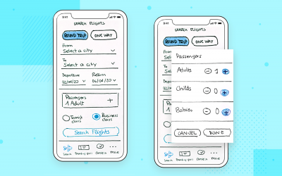
Prototyping at different levels of fidelity happens in every phase of product development at Dropbox. It’s an important communication tool, as well as a way to express feedback and ensure designs are built exactly as the designer imagines them.
Designers at Dropbox will frame the problem they’re working on — whether it’s a user problem, interaction problem, or a visual problem — and bring it to the design sessions our team holds three times a week. People will brainstorm ideas and interactions while sketching out the lowest-fidelity prototypes in the design process.
In addition to AdminX we’ve also seen the recent rise of Dropbox Paper, which seems to be a challenge to Google Docs. What interface elements make Paper different from other cloud storage and file synchronization services?
Our view of the world is that work is changing and becoming more collaborative as teams become more dispersed. We also believe the greatest things are built by teams in collaboration with one another.
Paper is a tool that strives to support this new way of working by putting ideas and collaboration first. Specifically, Paper was designed to prioritize expressing early ideas, sharing, collecting feedback, storytelling with images and media files, and presenting in-progress work. You’ll notice when you open your first Paper doc that it is designed as a blank canvas, conducive to writing first and formatting second.
As for specific UI elements, the cheeky gray default prompts on each new doc encourage you not to overthink when you get started with a blank canvas. The plus (+) icon unrolls when clicked to provide formatting options to support your ideas. “Share” is the only visible call to action.
The people you have shared the Paper document with are immediately visible in a facepile, and these faces come into full color to communicate the presence of another person in the doc or seen state. If you @mention a person in a comment, the document is shared, and you can easily reply with words or a lightweight emoji or sticker.
Paper is meant to help people share ideas early and collaborate — and we have just gotten started.
How do you design UIs that promote and facilitate teamwork?
Designing UIs for teamwork means prioritizing use cases to maintain simple and straightforward product experiences. When you’re designing for many different types of users, it’s easy to get overwhelmed by the many features you could be building and the many problems you could be solving based on conflicted needs.
It’s incredibly important to keep clarity of purpose for every tool you design.
To kick off the design process and get to this clarity quickly, it’s important to align your cross-functional team around who the different users are, whose needs you are prioritizing and why, and what behaviors you want to support, enable, or drive.
The design of that tool should support its purpose. Once you have that level of clarity, the UI decisions and elements start to fall naturally, as in the example with Paper above.
Dropbox products are both client and business facing – what are the different challenges you find when designing enterprise software versus consumer software?
Companies can fall prey to their own silence about who they are building for and are afraid to declare that they care most about their end users. Without openly declaring the importance of your end user, it’s easy to build one-off features that a particular customer asks for in order to close large accounts — after all, the business has needs, too.
The experience can quickly become overrun with convoluted flows and irrelevant features. This silence can be fatal to a product experience. For B2B products, if you care most about your end users, say so.
Can you give us an example of a time a prototype helped Dropbox solve a tricky situation or design something really cool?
We use prototyping at every level of fidelity to help us solve design problems. One of the designers on my team is currently working through figuring out what the interaction model and relationship should be between content pulled from Dropbox and a surface he’s designing to hold that content.
Thinking through how people will understand the representation of this content in a new surface, he drew different options on the board so that we could talk through trade-offs at a high level. After all, whiteboard and sketching is still the most important high level prototyping tool!
When interpreting how someone should be encouraged to customize and play with the Dropbox content on the page, the designer needed a higher fidelity interaction program and used Principle to create quick prototypes.
You were an inner city school science teacher once upon a time; what did that teach you about product design and usability?
As a teacher, you are constantly thinking about the environment you are trying to create for your kids and how you want them to grow and change over the course of the year. Software design is similar — you imagine what behaviors you want to support and drive, and then execute to reach your goals.
For example, you have to understand the needs and motivations of your students, which is analogous to understanding the needs and motivations of your users. You have to set goals, which is analogous to having a north star and point of view around what you want a design to do.
You have to remove obstacles in the way of their success, which is analogous to designing a simple navigation. You have to give them grades, which is analogous to giving feedback in software when things do or don’t work.
You have to recognize and celebrate their successes, which speaks to the emotional, human, visual aspects of design — the moments of surprise and delight that we weave into our interfaces.
On a personal level, you really internalize the process of prototyping — you try a new teaching technique or way of presenting information, figure out whether or not it lands with your audience (it often doesn’t), and use that learning to refine your next lessons.
Tell us one pet peeve you have as a designer, and how you would improve it.
At the moment, my feet are cold, so…. I’d probably re-design shoes to capture the energy from walking to power a battery that regulates the internal temperature of the shoes. I hate having cold feet.
Related Content
 UX design portfolios are your chance to showcase your top skills and best work. Check out this post for awesome portfolio examples and websites!10 min Read
 Learn what paper prototypes are, how to make them and how they can help you design better products. Awesome examples and free templates inside!10 min Read
 In this comprehensive study, we dive deep into the world of web design tools, comparing features, pricing, ease of use, and more. Whether you're building a simple landing page or a complex e-commerce store, we've got you covered. Let's explore the best options and help you make an informed decision.30 min Read


