Folks quickly noticed they needed a design system - but the road to a good system can often be a maze. Check out how things played out at Wells Fargo.
We had the honour of welcoming a group of UXers from Wells Fargo, who shared some of the wisdom they’ve gathered from creating a successful design system. We were delighted to hear the entire story from the moment they realized something was missing, to the grand task of maintaining what they created.
to build and manage design systems
We all know a design system is a complex thing. From the making of the system to what it needs to include, there are so many factors at play. That’s why us and our audience loved hearing about the first hand experience our speakers had with their design system.
Meet our speakers:
- Kristina Ross: Experience Designer
- Gerard Cohen: UX accessibility
- David Hom: Product Manager
- Mindy Madison: Design Delivery
- Sarah Bellrichard: Moderator
Live from SF with the UX team at Wells Fargo
Posted by Justinmind Prototyping Tool on Thursday, 11 July 2019
All big things have to start somewhere, for some reason. For the crew at Wells Fargo, the changing times led them to the concept of a design system – even if they themselves couldn’t see it until later on.
The engineers at Wells Fargo had a very important task: to create a new website to suit the changing times. This massive change, logically, came with the daunting challenge of completely re-making the user interface. With the realization that the engineering team very ill-equipped for the task, came the conclusion that they desperately needed a design team.

This conclusion resulted in the creation of a UX design team. A single team that would include visual designers, UI designers, developers and everyone else needed to deliver on a new website. But they soon realized that the new website was just the tip of the iceberg.
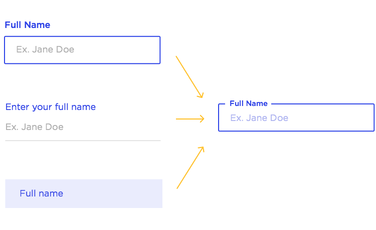
Once they had the right team put together, the team took a hard look at the apps the company had, and quickly noticed the lack of consistency throughout the apps. With such a large and diverse institution, it’s only normal that they would have a large array of digital products – but the fact that they were all different from each other wasn’t ideal by a long shot.
“You had over 50 different apps and 50 different date-pickers.”
Mindy Madison - Design Delivery officer at Wells Fargo
Which pegs the question of how they could possibly fix that issue. Redo all of them? How could they go about that? The developers were the first ones to point out the obvious: that having to code each one of those components over and over again was deeply inefficient. Especially when we have several different versions of the same component.
And so the idea for a solution was born. They would get the entire UX team together, and create a certain set of components that would be used for all their products. As we heard from Mindy, this was a smart move as it not only laid the foundations for their design system, but also helped them identify and correct bugs with the entire team.
Curiously enough, it was two external factors that truly consolidated the design system at Wells Fargo:
- The rise of both touch screens and responsive design, which forced a new wave of changes if they wanted to keep up with the market.
- The Obama administration passed a law which made accessibility a real responsibility for businesses, officially placing accessibility at the center of UX design.
It didn’t take long for top management to see the benefits behind this initiative. Once the cutting of costs and impact on productivity became clear, they were happy to champion the design system across the entire institution. Our speakers recognize that it wasn’t easy to get everyone to adopt the design system, but it was decisive in making Wells Fargo what it is today.
Eventually, the time for a new version of the system came but with one different factor – the need to align the UX design process to the business strategy. With top management fully onboard, this meant that their UX team grew even further! They evolved into a fully cross functional team that could achieve even greater things.
Fast forward. 5 years after the folks at Wells Fargo first decided they needed a collective framework for their UX design, the market was moving faster than ever. It was bigger, more diverse than ever. At this point, there was a long list of possible devices people used as well as a broad range of browsers.
Version 3 of the system needed to address this fragmentation in the market, as well as deal once and for all with the issue of aligning business and design. The answer, they concluded, was to include Product Managers (PMs) in the UX teams.
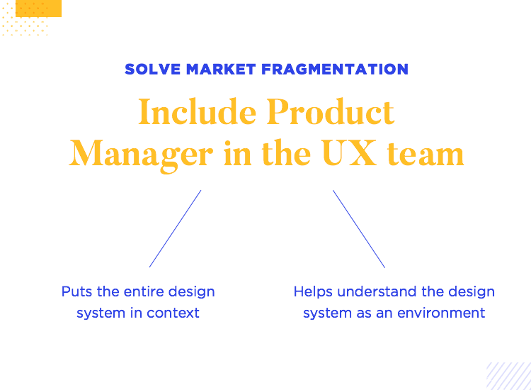
Having a PM helped with the business aspect, and helped put the design system into context with the rest of the team members. The real conclusion here was that a design system wasn’t just a collection of individual components – in truth, a design system is an environment.
And while it may seem like a small change in thinking, an environment is complex in nature but it’s also where things grow.
Orchestrating a design system in a large company is no walk in the park. As our speakers shared with our audience, it came with several other implications that were complex in their own right – some of which are downright painful for us here at Justinmind to imagine.
This is something that sounds just terrifying, but back then the tools available for prototyping and designing just didn’t cut it. They needed realism, functionality. The lack of a real prototyping tool that could help them create actual prototypes of their apps forced their hand: they had to build their own design tools.
While this posed an additional challenge, it wasn’t necessarily an issue. The real issue was that the same team needed to cope to produce these tools, while also keeping with the market for increasingly more frequent releases of versions. Each version had some type of variation from the previous components or features.
This was the moment that the entire team came to realize what they had in their hands. Up until this point, the Wells Fargo guys thought they had put together a framework to smooth things out. This is when they came to realize that they had created a real design system.
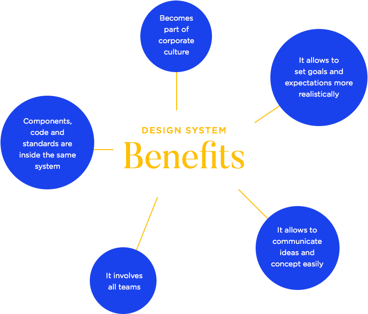
But how is that important? Well, a design system is meant to be a key part of the company. Having a design system meant that the very corporate culture at Wells Fargo needed to adapt, so that the system was in the middle of it all.
Having not just components, but templates, code and standards inside the same system proved very beneficial. Not only did the design process improve, it also helped the team communicate design concepts and ideas much more easily.
In no time, the design system had evolved into this platform that helped them design, communicate, set goals and define expectations more realistically.
A design system is an environment. A vital part of that environment are the people who will be using this design system in order to create things – and managing the system implies managing the people too. That’s what Gerard told us, while sharing one of his favorite quotes on how to deal with this aspect of management.
It takes equal parts courage and humility
The idea of getting team members to innovate is closely linked to having people believe in themselves. Team members need to have courage and believe in their own ability – to have the courage to voice their opinions.
Then there is the other side of the coin: the humility to recognize you won’t always be right. A design system is centralized and unified – which means that while everyone can chip in, not everybody can have their way.
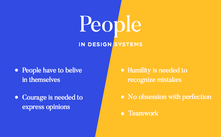
It’s important to stay humble, and bear in mind that you’re part of a team. To get many different teams working on the same platform, everyone needs to work together towards a common goal.
This is when Kristina shared with us a crucial aspect of her philosophy when managing design at Wells Fargo: the search for perfection. While it’s easy to get caught up in looking for the perfect design, the perfect interaction or the perfect component, Kristina says: don’t. It will be the end of your mental health.
Key point: Kristina loves the idea of having both courage and humility, because having humility also includes the humility to recognize you won’t ever reach perfection. There is no such thing.
And so, it’s important for everyone to be aware that a design system doesn’t directly translate to perfect consistency. In truth, the system was put together by different people at different stages and will evolve over time.Here is what to do instead, so you potentialize the system while making sure your staff doesn’t lose their sanity.
Focus on the problem you’re out to solve. Make sure you got the problem statement right. Ensure interaction design is sensible. Check that the accessibility guide is accurate and comprehensive. And on top of it all: allow it all the space to grow into something else entirely. Every component or feature has its own life cycle.
Once a component is introduced to the design system, it becomes its own thing. Our speakers were all in agreement that each component will evolve into a new thing – and will be used for purposes no one could have imagined at the start.
“Good choices aren’t necessarily going to be perfect choices. Don’t let the perfect be the enemy of the good.”
Kristina Ross - Experience Designer at Wells Fargo
The entire team should enjoy the feeling of success when a change is planned out and implemented across all products correctly. That is no easy task! As Kristina puts it, this change and implementation is innovation at work. It’s progress and improvement – and its all any of us can ask for.
Our speakers were very clear that they believe communication to be an essential part of a design system workflow. One must manage the entire system along with the people involved in it like a garden.
People make mistakes and things get lost in translation. That is only natural. The design system doesn’t just rule out the need for great communication. People still need to have some guidance as opposed to a policing force that pushes them. As we heard from Kristina, pointing people in the right direction in a constructive way is key in any project.

A good gardener sets plants up for success by offering them a good structure they can climb, as well as the resources they need to thrive. Team members can rely on the system for material orientation but many times it will fall on the team manager to help them see the right path.
“Be gardeners, not police”
Kristina Ross - Experience Designer at Wells Fargo
A crucial thing around running a design team that is so extensive and diverse as the folks at Wells Fargo is that it’s never about establishing authority. You want every team involved to have enough freedom to apply their skills and put their knowledge to good use. Courage and humility, right?
Another side of the same coin to the upkeep and maintenance of the system itself. You need to prune things that no longer belong in your system, and pull out weeds that could be harming in the future. That means keeping an eye out for components, templates or even features that have reached the end of their life-cycle.
There is such a thing as too much information. You don’t want an endless list of components and templates in your system, as that means more confusing design work and more effort in keeping everything tidy.
You want to get everything organized and consolidate exactly what the design system needs to have. Cut out the excess. It’s ok to go back and revise what you want to be in the system, as long as everything in there is constructive.
People are very likely to behave in certain patterns. To David, there’s a pattern that repeats itself across teams everywhere – and it’s one you should watch out for.

Within a team, you’ll have a few people who are very vocal and participate in every single decision – they tend to end up as “the person with the answers”. Other team members will always turn to these few when looking for answers on the system or about the project.
The issue: While this isn’t necessarily bad, it does impede true growth - you’ll be limiting the entire team to only a few “experts”.
A good response in the face of this challenge is to hold group meetings. By getting everyone in the same room, people realize that they have the same questions, the same difficulties and the same problems. Once they notice the problems are the same, they start to look for a solution as a team.
Gathering the requirements for the product should be done with every single team in the room. As David explains, this is beneficial because it takes all the challenges each team faces and lays them down for all to see. It’s important, for example, for design to know what kind of technological limitations developers face when creating the products.
This kind of knowledge helps everyone have a more contextual understanding of what can be achieved or what is even feasible for the entire crew. The ultimate goal here is to have each team understand how other teams think, so they anticipate the challenges and priorities of each one.
So did the system solve the problem that led to its creation in the first place? Our speakers didn’t hesitate to say the answer was yes. After all, the real issue that made people lay down the foundations for the system was that the same things were designed and coded over and over again.
The design system eliminated that problem entirely. Now, the individual components already exist and are available for everyone, at any given moment. It’s had a huge impact on their productivity, as they never start from zero. The building blocks of their products are ready – leaving a lot more time to focus on other issues.
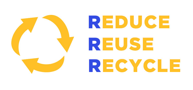
David summed up the general effects of the design system on Wells Fargo in 3 brief points.
The system does a lot of the initial work for the team. There are so many things they no longer need to worry about. The result is that the brainpower needed to solve problems is much lower. The amount of work needed for a project to take off is much lower, making it possible for that effort and time to be invested elsewhere.
Every little component, template, pattern or even decision within the system can and should be reused. They are the first building blocks of the design and the fact that they are all organized in the same place makes a huge difference for everyone when it comes to getting things done.
With each step, comes a lesson learned. For our speakers, the design system helps them recycle these lessons – applying the things they learned to future projects. This is closely connected to the idea of shared knowledge in the team – everyone learns different lessons with each project.
In the UX game, there is a wide range of things that keep people up at night. Depending on what part of the product development you’re a part of, you may find that external factors eat away at your sleep hours. For our speakers, these are the things that eat away at their sleep.

The main concern david has regards the key functionality of their products. Acutely aware of how fast times are moving now, he lays awake in bed thinking “are we still a solution?”. This is a concern that most product managers will share – external factors that create the need for your product can change faster than any of us would like to admit.
For Mindy, there is one main concern on her mind at all times: how do we stay ahead of the curve? It’s a similar thought to David’s, with a key distinction. It’s not just about staying functional and beneficial to the user – but managing to stay competitive.

This touches all things from making sure the products work with new browsers, to provide responsive design for different and emerging mobile devices.
Kristina lays awake in bed at night thinking about communication. Even with such a centralized asset like the design system, there is still the matter of strategic communication. How much does the team need to know? And how do we tell them?
The main concern here is how to communicate strategic goals, from a business point of view. For Kristina, the search for the right language continues.
For Gerard, the prime concern is accessibility. Wells Fargo makes products that are widely used by businesses and their employees – which means users can’t just abandon the product if its not accessible. They don’t have a choice, and rarely get to give feedback on key issues like accessibility.
The crew at Wells Fargo went through an incredible transformation with the arrival of their design system. It changed more than just their workflow- it changed the very way they look at design and how they approach problem statements. It’s had a massive impact on the company as a whole, and proved to be decisive in the creation of the institution we all know today.
If there is one key takeaway from this UX talk is that while a design system is many things, it can never replace the work of real people. True leadership is still crucial in the search for success, just like communication between team members is still a make or break factor.
The general idea is to create a system that opens up more space for those human factors, instead of trying to use a system to replace the human touch.
PROTOTYPE · COMMUNICATE · VALIDATE
ALL-IN-ONE PROTOTYPING TOOL FOR DESIGN SYSTEMS
Related Content
 UX design portfolios are your chance to showcase your top skills and best work. Check out this post for awesome portfolio examples and websites!10 min Read
 Learn what paper prototypes are, how to make them and how they can help you design better products. Awesome examples and free templates inside!10 min Read
 In this comprehensive study, we dive deep into the world of web design tools, comparing features, pricing, ease of use, and more. Whether you're building a simple landing page or a complex e-commerce store, we've got you covered. Let's explore the best options and help you make an informed decision.30 min Read
