Banking on User Experience: Q&A with Lloyds Bank Senior UX Designer

Lloyds Senior UX Designer talks enterprise UX, how prototypes help validate ideas, and what Mortal Kombat teaches us about user experience
User experience and financial services. Two terms that, until recently, were rarely uttered in the same breath. Banks have long had the reputation of delivering online experiences that at best were dry, dusty but ‘dependable’, and worst, alienating and confusing.
But that is changing. Mobile banking users worldwide are set to grow to 1.8 billion by 2019, according to KPMG, and UI innovations such as fingerprint ID are creeping into the apps and sites we use to bank. Banks like Lloyds are leading the charge in updating antiquated enterprise applications with a UX perspective, expanding their user experience teams and usability testing on prototypes.
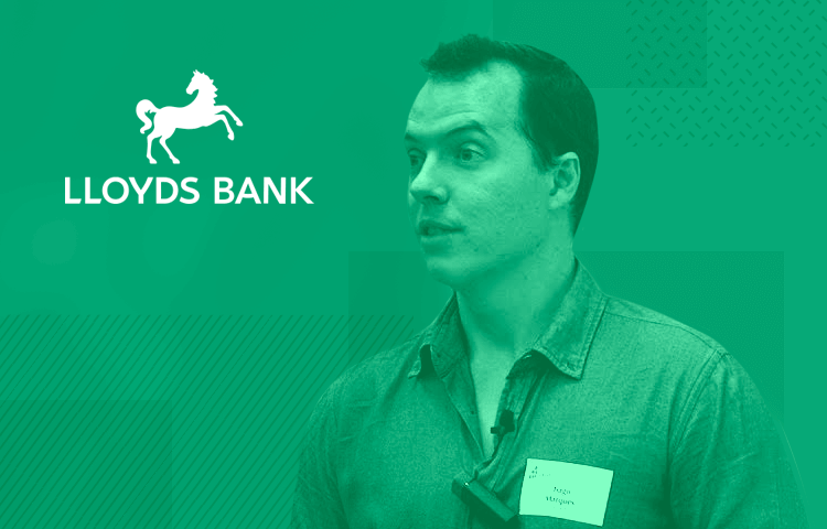
UX Designer Tiago Marques is passionate about Lloyds’ UX overhaul, and about the opportunities FinTech presents to him and his User Experience team at Lloyds. Tiago has focused on UX and financial services for a few years now, a path which has taken him to Barclays, WorldPay, American Express, and currently Lloyds, the UK’s largest retail bank.
With a CV like that and the promise of some Mortal Kombat X chat, we couldn’t wait to interview Tiago! He shared his wisdom on the particular challenges facing banking and UX, the importance of a solid UX strategy, and why prototypes play a key part in solving UI design problems before they arise.
Lloyds isn’t the kind of company one associates with UX innovation. What do you and your team spend your days working on at Lloyds?
The whole financial services industry has a bit of a reputation, doesn’t it..? Fortunately things are changing, and Lloyds really is one of the most attentive banks when it comes to listening to their customers, even if they tend to be more on the conservative side.
Without supportive, visionary leadership in the financial services industry, change will inevitably happen much slower than is ideal.
Currently at Lloyds we’re about 30+ UXers and pretty much everyone is juggling multiple projects at any point. Work varies from refining the online/mobile experience around classic financial products (such as loans, payments and statements), improving fraud prevention, all the way to several future-thinking exercises on topics such as APIs and Open Banking.
You’re an expert in user experience and financial services. In your opinion, why has this sector been so slow to catch on to the advantages of UX?
Until recently, the financial services industry (and specifically retail banks) didn’t really have a reason to change. There simply wasn’t a business incentive for banks to become more progressive or in tune with consumers’ needs, since people needed banking services for their daily affairs no matter what, and there were no new challenger banks stirring the waters for many decades.
Consumers have also been quite slow at reacting and raising their own expectations around banks, both in the quality, sophistication and transparency of services. Digital and mobile are helping to change this as the high street branch is no longer the main point-of-sale for most people and, well, the banking crisis of 2008 also helped question society’s very relationship with banks.
Technology-wise, most banks are struggling with outdated IT. When online banking first took off years ago, resources were mostly allocated towards “technical resilience” and “security” (which are particularly vital in a financial environment) but somehow “scalability” slipped through the requirements.
Without supportive, visionary leadership in the financial services industry, change will inevitably happen much slower than is ideal.
As a result, because their legacy back-end systems often impose enormous constraints on what can be created or modified, it is very difficult for traditional banks to experiment with UX.
Lastly, when it comes to empathy for the user, how exposed are the leadership figures to consumers and their everyday needs? How fluent are they on digital product design, consumer technology and user experience? These are fundamental topics for modern banking, increasingly a digital service.
What are some of the challenges facing Lloyds in its attempt to become more user-friendly?
All traditional retail banks are struggling with the same issues. Legacy IT is definitely a big one: everything is so tightly locked down that even small changes to a service can sometimes take months of development and testing before they can become publicly available to customers.
The more engaged with the business your UX team is, the more their collective energy can help your company rise in UX maturity.
Compliance, legal and other governance bodies also contribute to making change very slow and often unnecessarily prudent in the financial services arena… It would be great if sometimes we could just go all Facebook on an idea and say “here, let’s publish this new feature on the site and if the customers like it we keep it, if not we ditch it”.
But the constant avalanche of legislation (and the amount of resources needed to handle them) definitely makes banks a bit more defensive than ideal when it comes to experimentation.
Can you tell us where prototyping fits into the design and development process at Lloyds?
It depends – some projects rely heavily on prototyping, either because that’s the way the team has been structured, or because we’re not entirely sure about the requirements or designs themselves so it’s better to validate them with some user research and testing before any development starts.
For those cases we start building prototypes quite early on, partly to share concepts and help our non-design stakeholders visualise and refine their ideas, partly to help us solve design problems with user testing… We even have a couple of user testing labs in our office in Chiswell Street which, unsurprisingly, are constantly over-booked.
Other projects, however, consist of very small implementations, meaning no user testing feels really necessary. We socialise a few concepts and sketches, get green light from the stakeholders and the development team, create a spec doc, and off we go. We might do a few prototypes to test some interactions, but that’s it.
Check out Justinmind’s tips for designing and prototyping mobile banking apps!
Can you give us an example of a time a prototype helped Lloyds solve a tricky situation or design something really cool?
Hmmm no, not particularly. When we do find the need to do prototyping and user testing, it’s because we’re already anticipating a potentially tricky situation and we’d rather be on the safe side – even if that tricky situation is just getting the stakeholders to understand their requirements more clearly.
We start building prototypes quite early on, partly to share concepts and help our non-design stakeholders visualise and refine their ideas, partly to help us solve design problems with user testing
What does the future hold for banking UX? Will things like VR or haptics influence the sector, and how will UXers react?
Virtual reality, augmented reality, AI, digital personal assistants… there are some really exciting new technologies coming into the market, but frankly they will only become relevant to banking once they become an integrated part of people’s lives and habits, meaning we’ll see them become mainstream before retail banking starts considering them.
Customers want to bank quickly, easily and transparently through the channels they are most familiar with and already have easy access to. For instance, biometric identification (like Touch ID), is already quite popular among consumers for quickly completing purchases on their smartphone, so banks have begun adopting it for some of their products, like logging in to their app.
Regarding the upcoming years, the biggest changes in banking UX will come from the opening of banking services via APIs – for the first time, customers will be able to bank via any number of intermediaries rather than connecting directly to banks, and this will change not just UX but banking itself in many ways.
Banks will no longer be the only ones reflecting and experimenting about banking.
And maybe, just maybe some unexpected collision of banking APIs and left field thinking will trigger a business ethos revolution in banking, which is what consumers need the most – financial services that help people develop a solid, educated emotional relationship with their money, become financially resilient and maximise the return on every pound they’ve worked so hard to earn.
Your recent talk at Mobile UX London was about what banks can learn from Mortal Kombat X. What have you learned from the legendary video game?
So much, really! There’s a lot of product design wisdom to be learned from video games (not just Mortal Kombat X) for both UXers and the banks – mostly because of the contrast between games and financial services.
Games are fun, they’re engaging, and they tend to have this vibe of playfulness and lightheartedness… Banking, on the other hand, can be quite dry, people are usually not that engaged with their finances and financial services can often feel quite alienating to consumers.
Regarding the game studios themselves, they’re known to be extremely proactive and constantly challenging one another to come up with more engaging products that stand out from the crowd, and striving to push the limits of existing technology and sometimes even forced to devise some new one of their own… not how you’d describe the banking industry, at least not just yet.
How important is UX strategy in an enterprise, and what are your top tips for implementing a UX strategy?
The more your customer relationships rely on digital channels, the more your business will need a cohesive UX strategy to stay focused. This is even more important for businesses that are not natively digital, like traditional banks.
Earlier I mentioned how banking needs visionary leadership, comfortable with various disciplines outside classical business thinking. But how fluent are we UX designers on business, marketing or financial markets? How easily can we describe a new idea or feature as a business case?
It’s very difficult for the business leadership and the UX specialists to have a meaningful conversation if you can’t speak their language and communicate in terms of their values. So go do your share: you’re already fluent in “user”, go become fluent in “business”.
The more your customer relationships rely on digital channels, the more your business will need a cohesive UX strategy to stay focused.
Also, remember you’re not just one person – you’re part of a design community. And the more engaged with the business your UX team is, the more their collective energy can help your company rise in UX maturity.
Nurture your team’s desire to contribute. Organise open keynotes and discussions, and socialise their work to help the company understand what UX is and its value for both the business and its customers. It will make a lot of stakeholder conversations much easier.
What advice would you give to recent graduates trying to get into UX design today?
Be kind to yourself and others. A good team is worth its weight in gold, so always try to be considerate to your team mates and bring out the best in them. Like someone once told me, “a leader unites, not divides”.
Be ferociously curious. The more you can learn and contribute to the world, the more the world will return in kind, so take full charge for your education – it’s a life-long process and your responsibility alone, nobody else’s.
Be brave. Have the courage to question your vision of the world on a regular basis and make difficult decisions. It will help ensure that you’re growing in the right direction, and using your design thinking skills for the right causes.
And if that last one was a bit too elusive for you, go travel and do some volunteering. I promise you six months later it will all make sense.
Tiago Marques would like to say Thanks to the following members of the Lloyds UX team for their feedback and discussions – guys, this interview reflects your passion for UX and meaningful banking as much as it does mine: Alicja Wielunska, Ben Warwick, David Evans, Marcus Alexander, Miles Sampson, Phil Masaba, Tony Sobers and Xavier Klingenfus.
Related Content
 UX design portfolios are your chance to showcase your top skills and best work. Check out this post for awesome portfolio examples and websites!10 min Read
 Learn what paper prototypes are, how to make them and how they can help you design better products. Awesome examples and free templates inside!10 min Read
 In this comprehensive study, we dive deep into the world of web design tools, comparing features, pricing, ease of use, and more. Whether you're building a simple landing page or a complex e-commerce store, we've got you covered. Let's explore the best options and help you make an informed decision.30 min Read


